


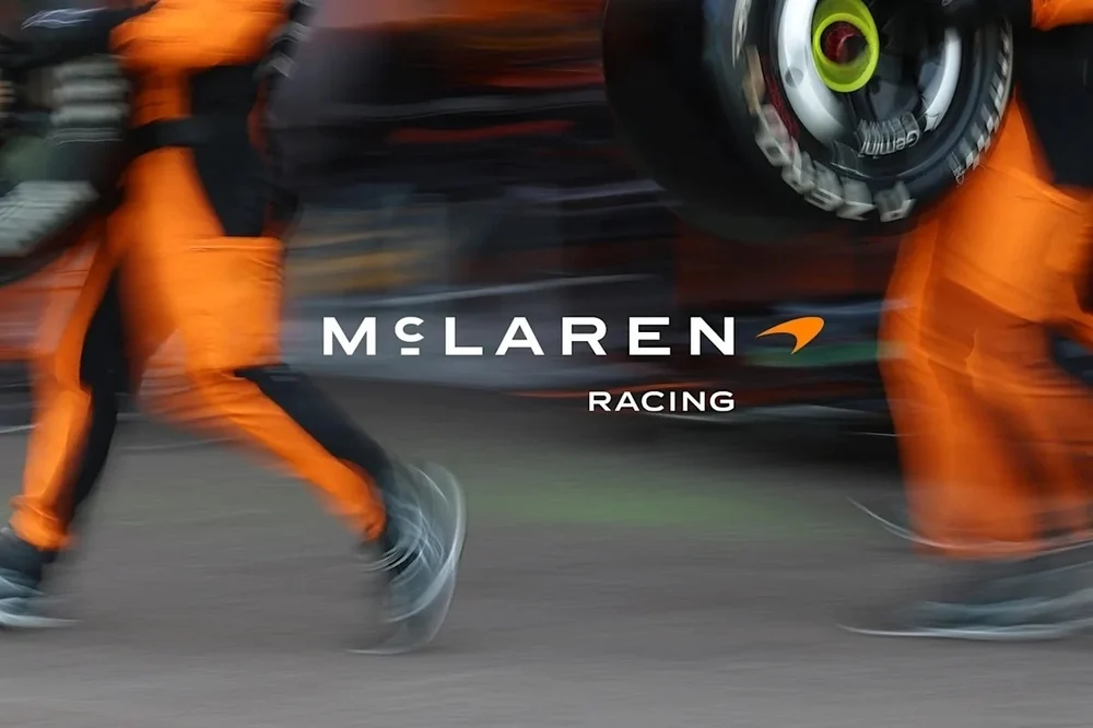
Spaced-out, thin, all caps, and quiet enough to pass for a fashion label: on first look, the new McLaren wordmark seems to follow the trend that has made half the luxury world look the same. Look more closely at the second and third letters. A small raised “c”, with a short line under it, sits between the M and the L. That detail is the whole story.

In late September, McLaren introduced a new identity shared by McLaren Automotive and McLaren Racing. It was developed in house by David Woodhouse, chief creative officer at McLaren Automotive, and Lou McEwen, chief marketing officer at McLaren Racing. The heavy italic wordmark with its orange Speedmark swoosh is no longer the main logo. In its place is a light, widely tracked uppercase wordmark set in a new custom typeface, McLaren Sans.
The source is not a moodboard. It is a sign. In Remuera, Auckland, Les and Ruth McLaren ran a family service station, and above its forecourt a hand-lettered sign read “McLAREN’S”, with the same raised and underlined “c”. It is an old typographic convention for the “Mc” prefix, once common in sign painting and now almost gone. This is also where their son Bruce built the car that gave him his first race win, long before his name went on Formula 1 cars and, later, supercars. In a sense, the logo was drawn decades before the company existed.

We think this is what keeps the redesign from becoming another case of luxury blanding. Without the cedilla-like underline, the wordmark would be a competent but anonymous geometric sans. With it, the logo carries a small piece of vernacular lettering that nobody else can claim, and that makes sense only if you know where McLaren comes from. It is a quiet move, but a specific one.
The Speedmark is not gone. The swoosh, often taken for a stylised kiwi, stays in the system, especially on the racing side, and so does the “Speedy Kiwi” nod to Bruce McLaren’s New Zealand roots. Colour gets the same treatment. Papaya remains the racing colour, while road cars move toward Midnight, a deep navy taken from the brand’s early history, within a wider palette that adds Ember, Anthracite, Colnbrook silver and Mist.
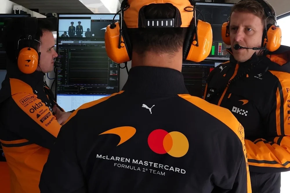

The timing explains a lot. McLaren is preparing for its first performance SUV and needs one coherent voice across very different products, from F1 liveries to cars aimed at a new kind of buyer. In Woodhouse’s words, the new identity is meant to be a “clearer and more unified expression of McLaren.” A lighter, more editorial wordmark is better suited to a showroom and a printed brochure than to a sidepod at 300 km/h. That trade-off is deliberate, and the racing side keeps its swoosh for that reason.

Whether the wordmark will work at speed, on a car seen for half a second on TV, is still an open question. As a piece of brand storytelling, though, it does something few rebrands manage. Instead of inventing a heritage, it went back to the forecourt and copied the lettering above it.
Images: McLaren

