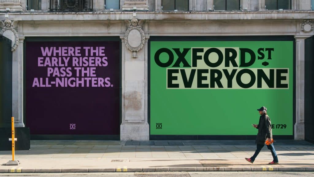
A purple poster on a stone shopfront reads Where the early risers pass the all-nighters. Next to it, a green one simply says Oxford St Everyone. No product, no discount, no shopping bag. Just the street talking about itself.
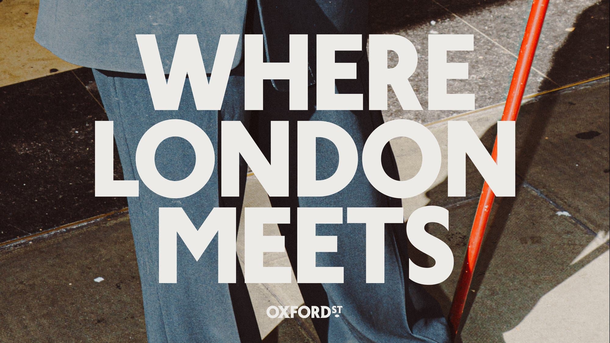
That is the tone of the new identity Koto has designed for Oxford Street, launched as the stretch between Orchard Street and Great Portland Street goes traffic-free. Strange but true: one of the most famous shopping streets in the world never had a brand of its own. Now it has one, and the line on the posters sums it up: Where London meets.
A street that finishes your sentence
The idea is hidden in plain sight. The little word for sits at the heart of the identity, and the rest of the system keeps completing it: Oxford St for shopping and stopping, for walkers and talkers, for early risers and all-nighters. It is a copy mechanic that can run for years without getting old, because the street keeps writing new endings.
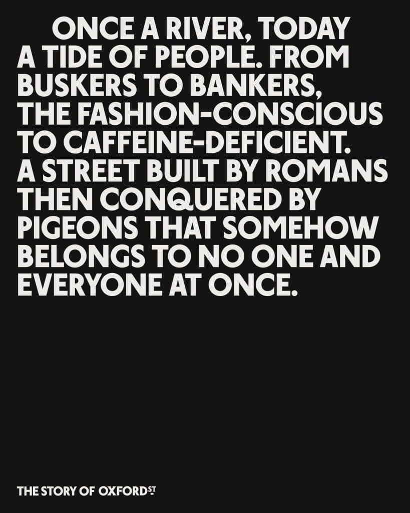
Koto built the story on a beautiful image borrowed from Virginia Woolf, who in 1932 compared Oxford Street to a tide of people. The studio took it literally: once a river, the Tyburn, today a tide of people. An archival map in the campaign shows exactly where the two cross.
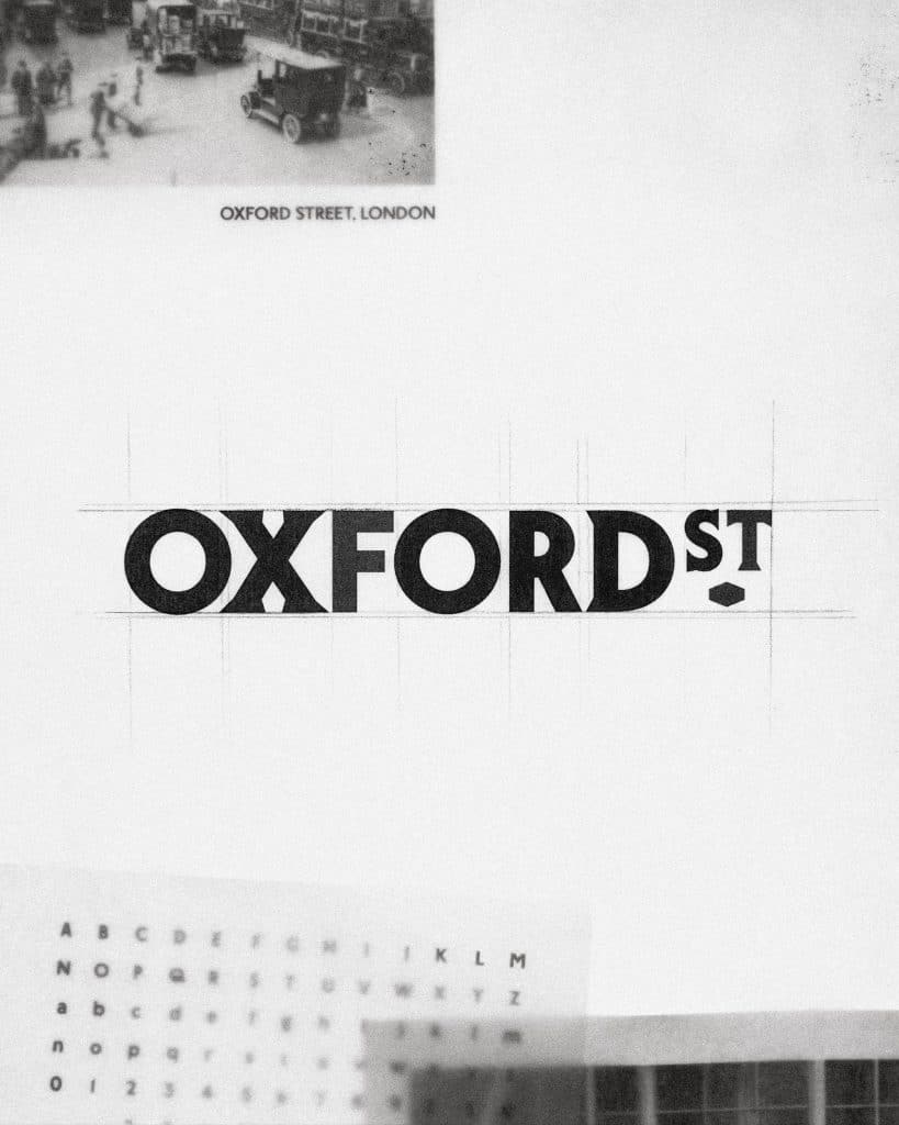
Type taken from the shop signs
The wordmark pairs London Sans, a contemporary typeface with a strong local accent created for the project, with a contrasting serif drawn from the street’s historic signage. A small lozenge, straight out of old shopfronts, holds the two together, while a monogram of intersecting letters signs every poster in the corner like a painter’s initials.
In the layouts the type does not stand still: lines flow and meander across the page, the way crowds do on a Saturday afternoon. Long texts go in white capitals on black, a bit like a timetable, a bit like a manifesto.
Green signs, real people
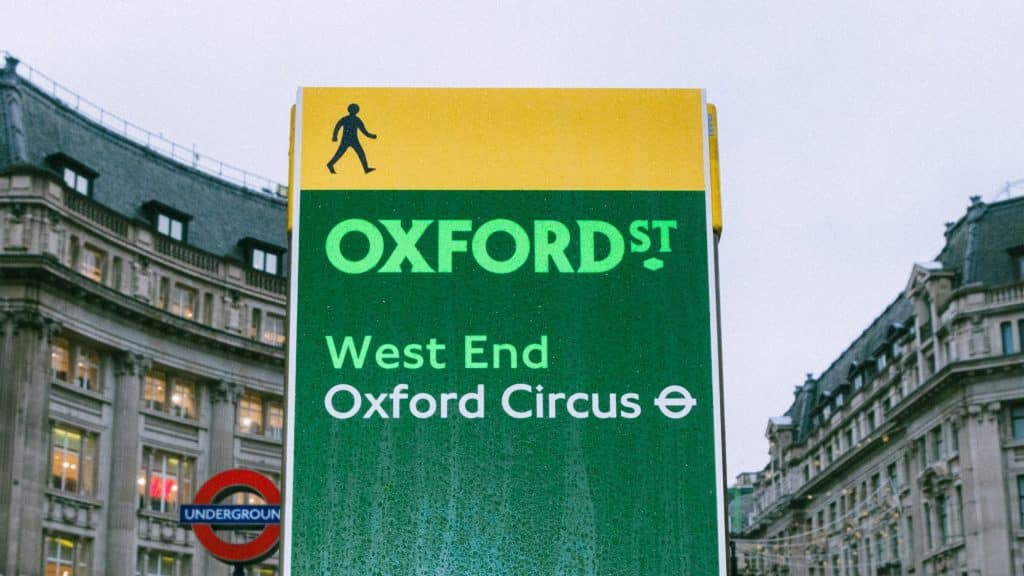
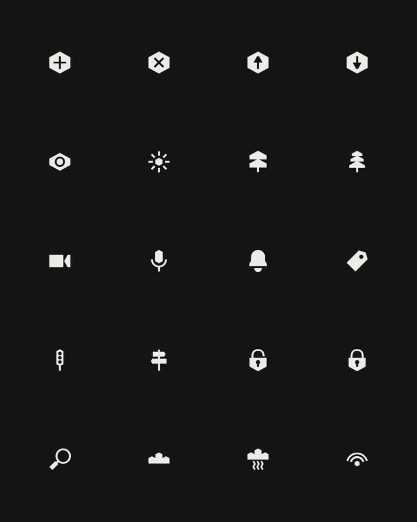
On the pavement the identity gets practical. Wayfinding signs use bright green on deep green, a nod to the greener street the pedestrianisation promises, and put direction first: the wordmark, then West End and Oxford Circus, nothing else. A family of 24 simple icons, from the sun and the tree to the camera and the traffic light, does the rest.
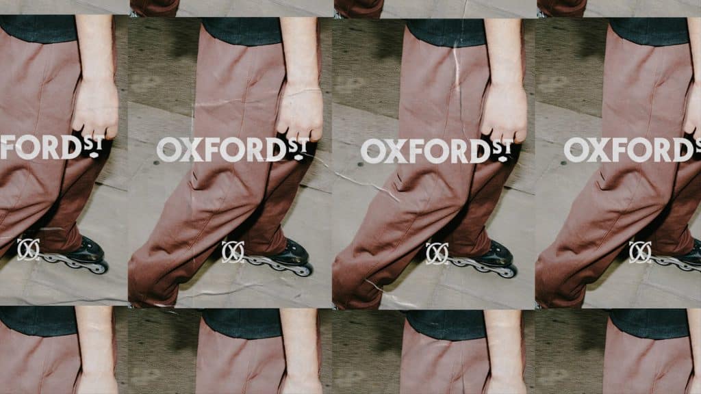
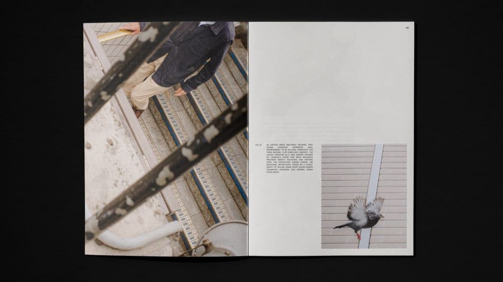
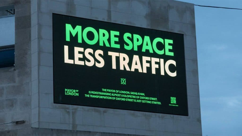
The photography is the part we like most. No glossy retail shots, but candid moments: someone gliding by on inline skates, a staircase, a pigeon in flight, the true locals. And on a billboard, the whole project in four words: More Space Less Traffic.
Place branding often ends up making a street look like a shopping mall. Koto went the other way and made the brand behave like one more person in the crowd. For Oxford Street, which has spent years fighting empty units and bad press, that might be the smartest move of all.