
A lilac Kindle lies on a café table, next to a cup of something purple and a quilted silver purse. It looks less like a piece of consumer electronics than an accessory picked to match the outfit. Which is exactly the point.

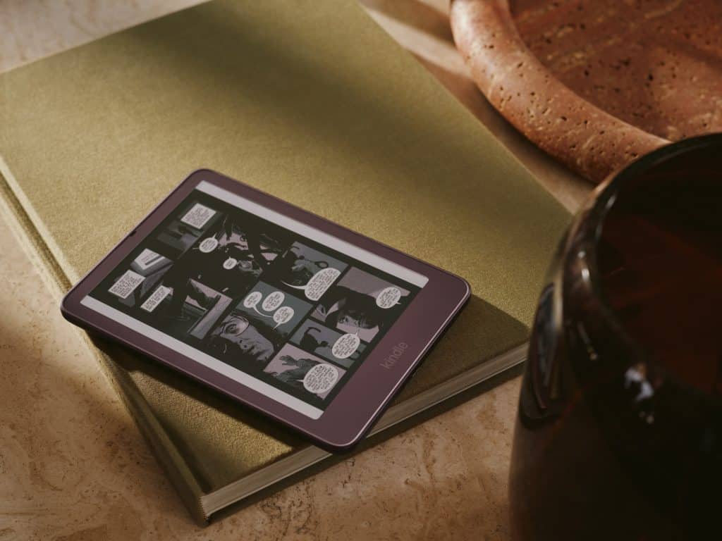
Amazon has redesigned its entire e-reader family, the Kindle, the Kindle Paperwhite and the Kindle Colorsoft, a year before the brand turns twenty. The headline change is one you notice with your thumb before your eyes: the screen now sits perfectly flush with the frame. For almost two decades, a Kindle page has lived at the bottom of a small plastic well, framed by a raised lip that collected crumbs, sand and the occasional eyelash. That lip is gone.
Flat out
The trick is what Amazon calls a “reverse-stack” display, a reordering of the layers that make up the screen, which the company describes as a first for e-readers. The result is one continuous, glare-free surface from edge to edge, with colour running right up to the border. On the lilac Ube model, a black layer beneath the cover lens keeps the reading area crisp while the tint wraps around it. The bodies have slimmed down too: the 6 inch Kindle is 6.8 mm thin and weighs about 140 grams, while the 7 inch Paperwhite, the largest screen the line has ever had, matches its thickness and drops to 204 grams.

Aluminium, at last
The other piece of material news is metal. The 32GB Kindle and the new Signature Editions of the Paperwhite and Colorsoft trade plastic backs for matte aluminium with 80% recycled content. Rather than machining each frame from a solid block, Amazon stamps the sheets before forging them, which wastes less material and, we suspect, costs less too. The entry model keeps a recycled plastic shell and earns a detail we are happy to applaud: a user-replaceable battery.
Then there is the palette. Ube, Seaglass Green, Alpine Sky, Fig and Graphite read like the board of a speciality coffee bar, and that is no accident: Amazon says it looked at café and dessert culture, encouraged by the demand for its earlier Matcha Kindle. “Customers are telling and showing us that they want their Kindle to express who they are through color,” says Chris Green, Amazon’s VP of design. In plain words, the e-reader has become something people photograph next to their latte, and Amazon has noticed.
Buttons make a comeback
A few of the accessories quietly admit that a touchscreen is not always the best way to turn a page. Kindle Click is a small Bluetooth remote for turning pages from under a blanket. The Page-Turn Cover is a magnetic case with physical buttons built in, and anyone who misses the old Kindle Oasis will recognise the idea. The Signature Editions add double-tap page turns, an ambient light sensor that adjusts the front light, and pogo-pin charging on a dock that holds the reader upright. Covers come in knit fabric, plant-based leather and pebbled leather.


Why it matters
None of this reinvents reading, and it is not meant to. What interests us is the direction of travel. A device that was designed for years to disappear in your hands is now being designed to be seen. The flush screen is a genuine piece of engineering in the service of calm; the colours and the aluminium are about desire. It is the same journey the iPod made twenty years ago, and a reminder that even the most functional objects eventually want to be liked.

The new Kindle starts at $149.99 and is available now in the US. The Paperwhite (from $199.99) and the Colorsoft (from $289.99) ship on 28 October.
Products: Kindle, Kindle Paperwhite, Kindle Colorsoft (2026)
Brand: Amazon
Design: Amazon Devices design team, led by Chris Green
Launch: October 2026
Images: courtesy of Amazon
Via: Design Milk
Read also: Pelican books are back with new graphics and Dot, the first Braille smartwatch