
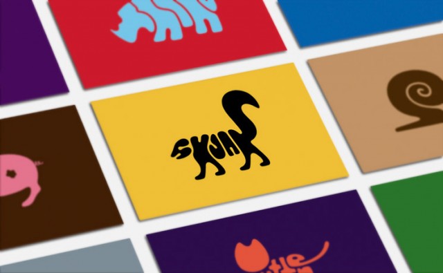
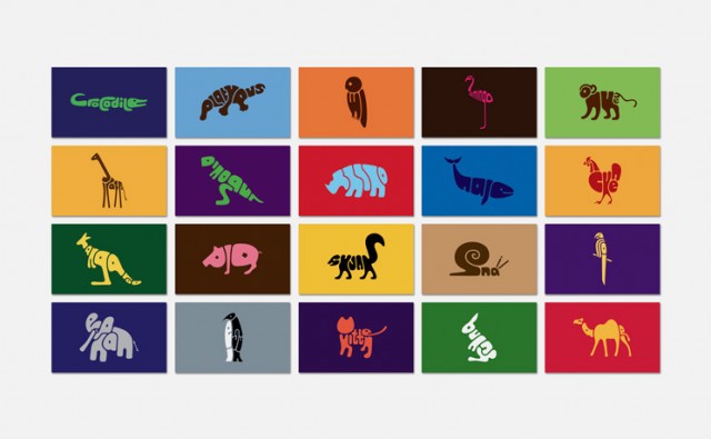
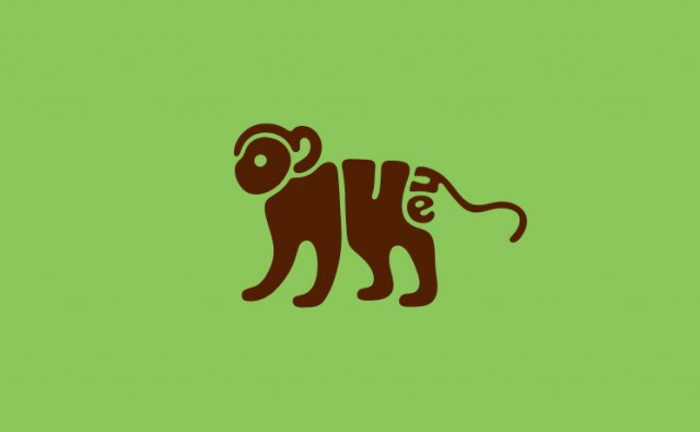
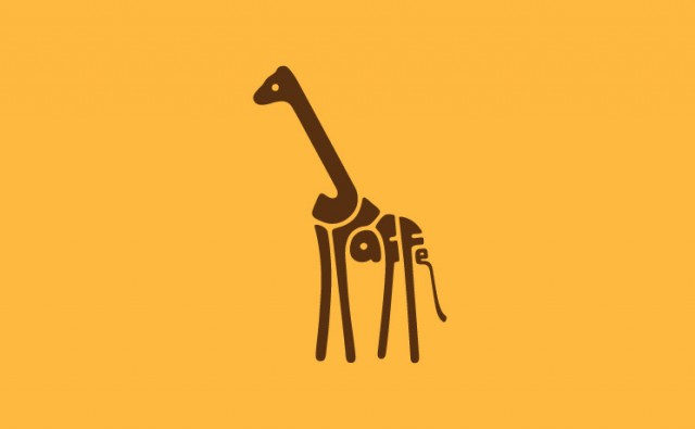
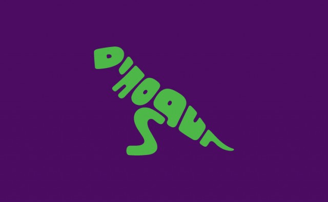
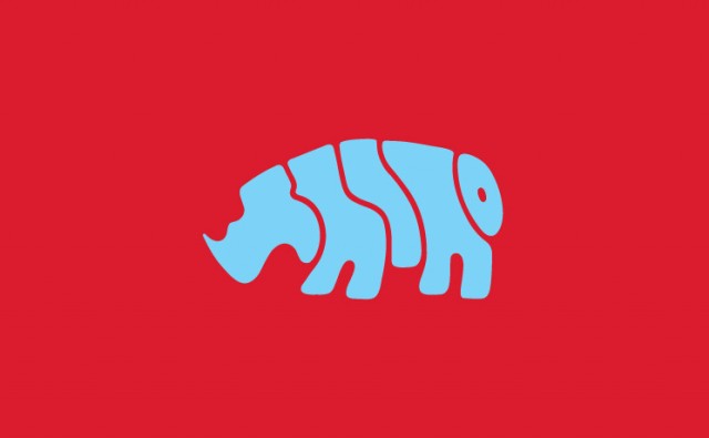
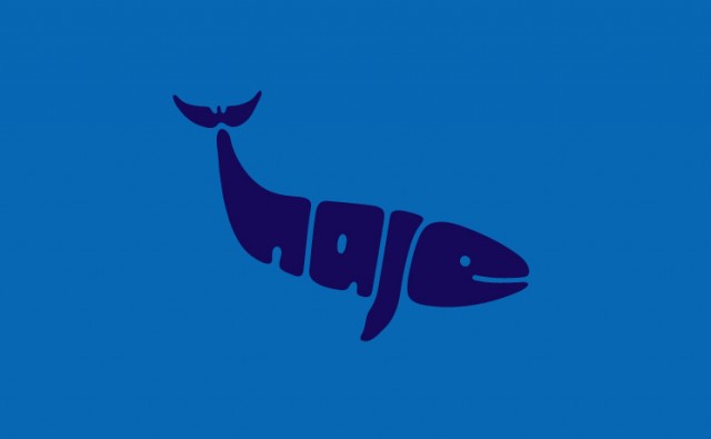
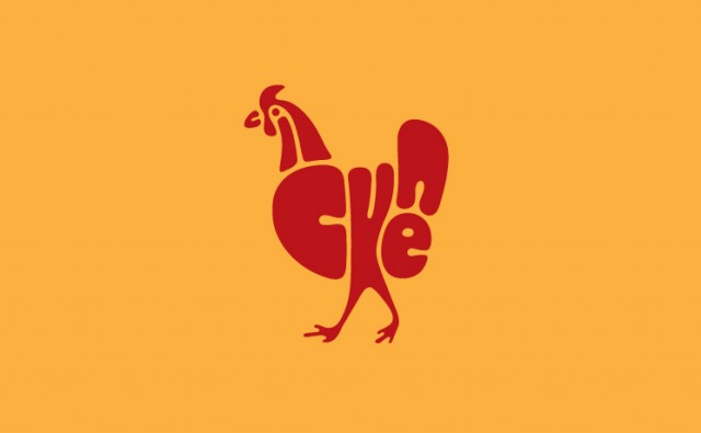
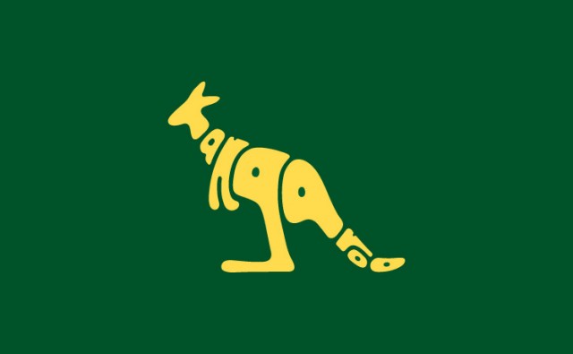
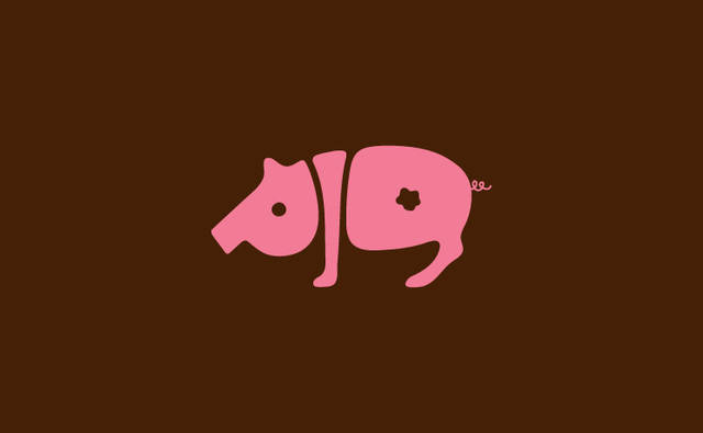
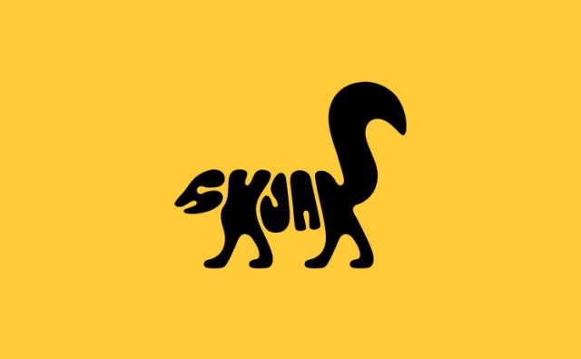
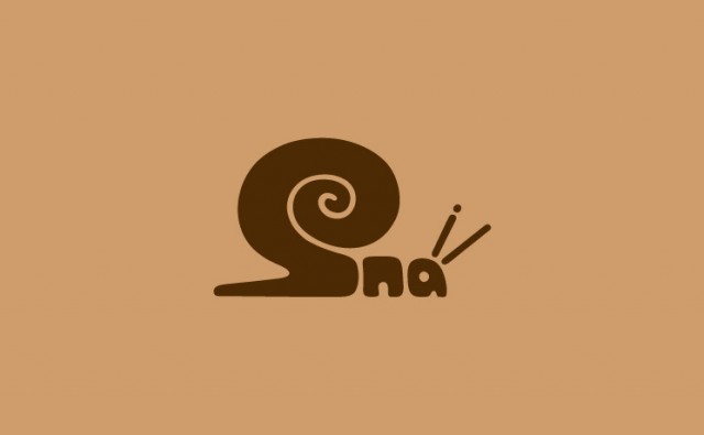
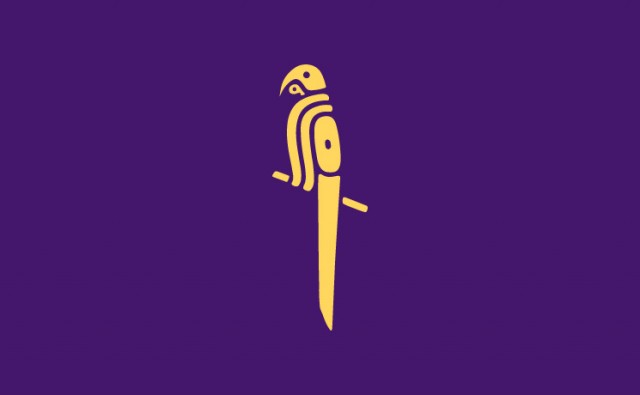
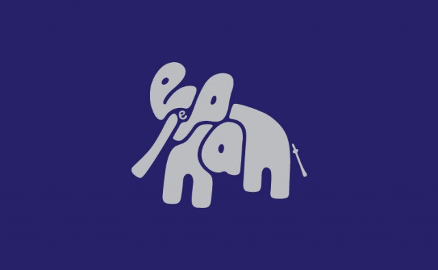
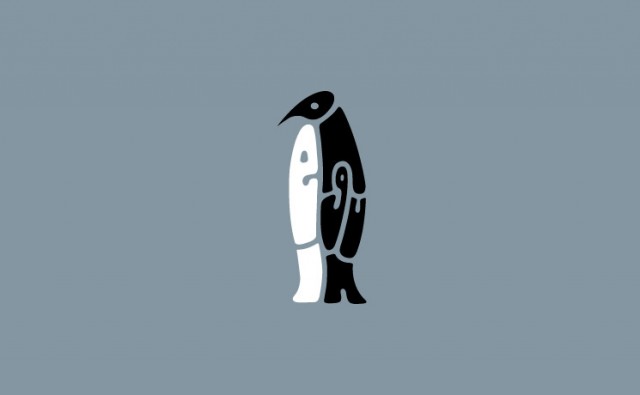
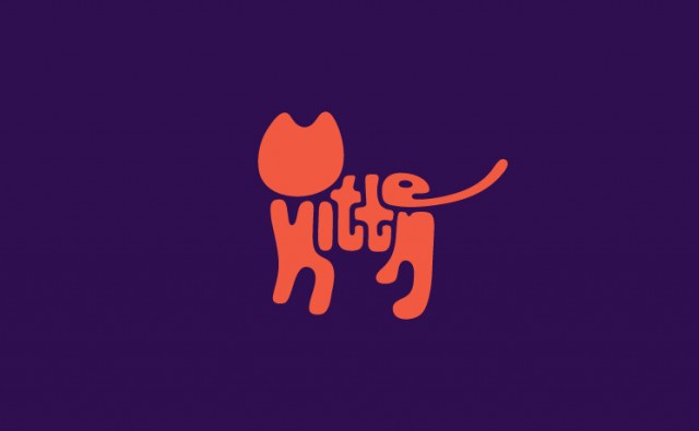
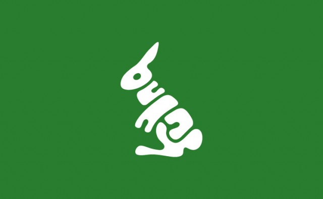
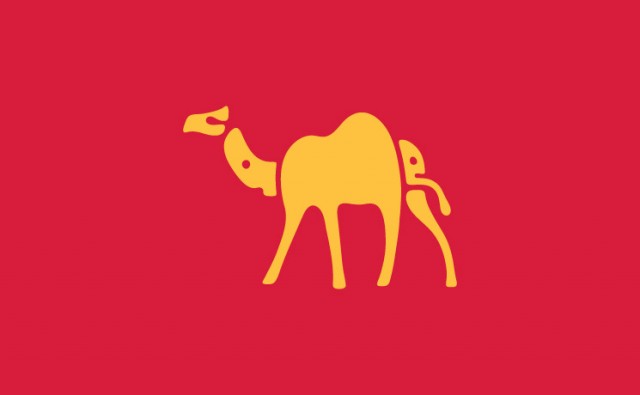
There is a moment, looking at Dan Fleming’s Word Animals, when you stop reading and start seeing. The word “elephant” settles into a heavy body and lifts its trunk. “Giraffe” stretches upwards into a long neck. “Snail” curls into a shell and lets the last letters crawl away. Every animal is drawn with nothing but the letters of its own name.
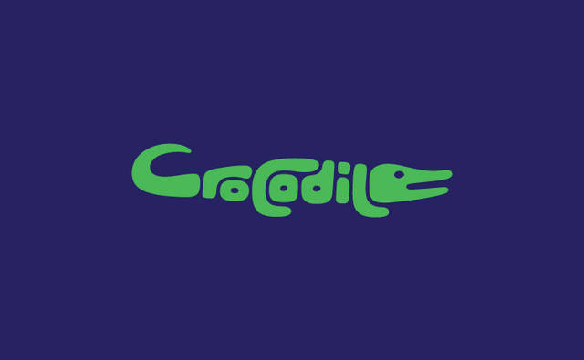
Fleming, a designer based in Melbourne, half British and half Australian, published this series of animal typography in early 2013, and it quickly travelled around the design blogs of the time, this magazine included. Twenty animals, from a crocodile to a camel, each one set in a single colour on a single flat background.
A logo that spells itself
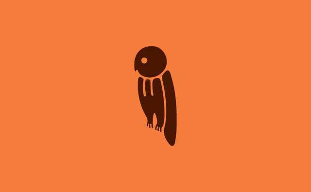
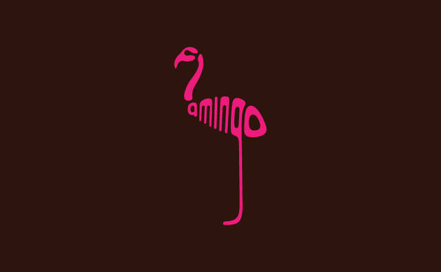
The rule is simple and strict: no extra drawing, only letters, bent, stretched and stacked until they become a silhouette. The flamingo stands on one long leg, the whale ends in a flick of a tail, the penguin is little more than a tall column of black and white type. It is the same idea behind the best wordmarks, where the name and the image become one thing, and it is much harder to pull off than it looks.
Fleming did not stop at the drawings. He built a whole identity around them, with business cards, letterhead, prints, t-shirts and a website, treating the series the way a studio would treat a brand.
Why it still works
More than ten years on, Word Animals is still one of the clearest lessons in typographic illustration, a reminder that letters are shapes before they are words. It is also a lovely way to show children how reading works, and a reliable way to make any designer smile.
Read also: A Dictionary of Color Combinations: Sanzo Wada’s palettes

Images courtesy of Dan Fleming. Story updated in November 2026.
Free newsletter, every Sunday
The Week on Feel
The best of the week in design, architecture and art, picked by our editors and delivered to your inbox.