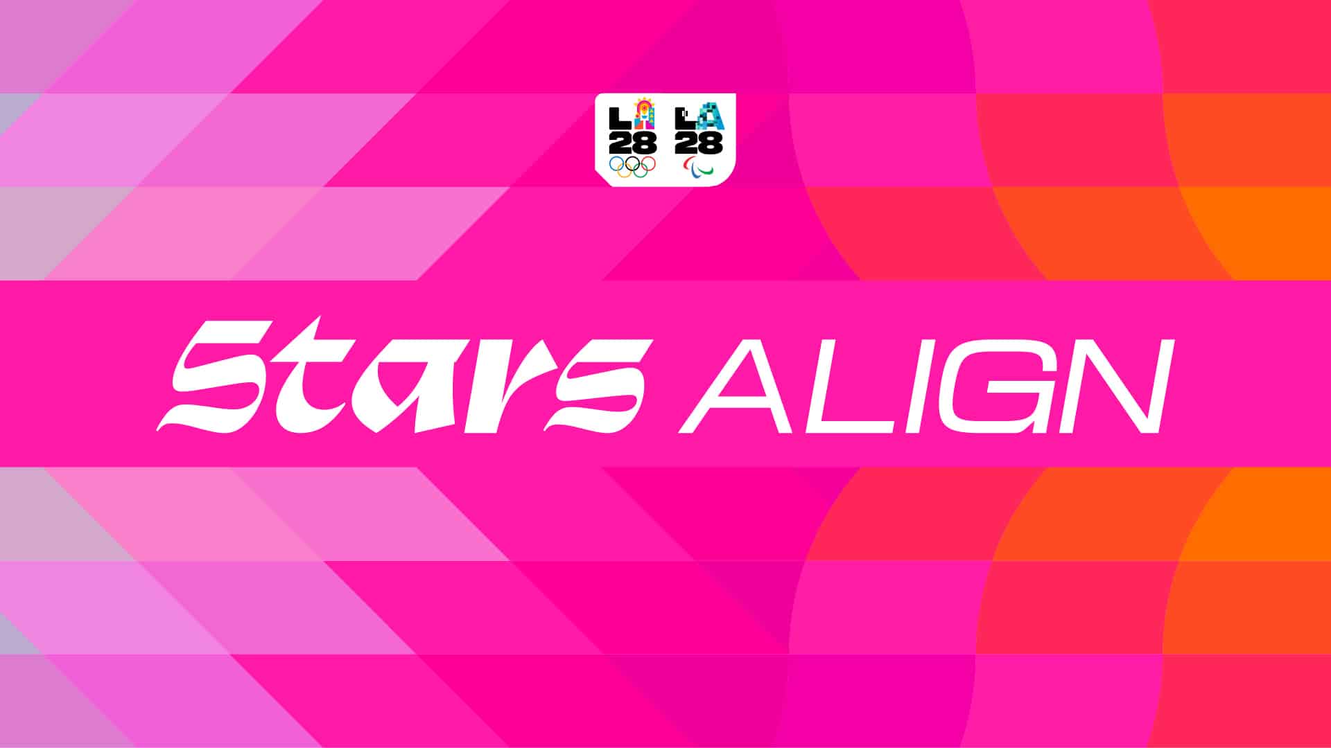
Two words, two moods. Stars swaggers in with a sharp, curly script that looks lifted from a hand-painted shop sign; ALIGN follows in a wide, cool sans that could sit on a scoreboard. Set in white on a field of hot pink and tangerine, it reads less like a corporate tagline and more like something you would spot from the car on Sunset Boulevard.
This is Stars Align, the official slogan of the LA28 Olympic and Paralympic Games, unveiled on 28 October. Los Angeles will host the Olympics for the third time, after 1932 and 1984, and the organisers have chosen a line about timing: extraordinary things happen when preparation meets opportunity, when athletes, coaches, volunteers, partners and small businesses all peak at the same moment.
LA28’s Chief Marketing Officer Alex Merchán sums it up in five words, “No one makes the Games alone”, and then lists what he means: an athlete’s early mornings, a volunteer’s first shift, a small business getting ready for the world, a fan’s voice in the stands. Stars Align is the moment they all click into place.
For us, the interesting part is the lettering. The slogan is built from the four custom typefaces drawn for the LA28 Look of the Games, which deliberately mash up styles the way the city’s strip malls and hand-painted signs do: a taqueria next to a nail salon next to a dentist, each with its own idea of what a letter should look like. Most Olympic identities aim for one confident voice. LA28 prefers a crowd, which suits a city that has never agreed on a single style about anything.
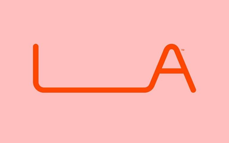
It also fits the emblem. LA28 has the first dynamic Olympic emblem, where the L and the 28 stay put while the A keeps changing, with more than 50 versions so far. A system that restless needed something steady to lean on, and two words in a fixed lettering do the job without taming the rest.
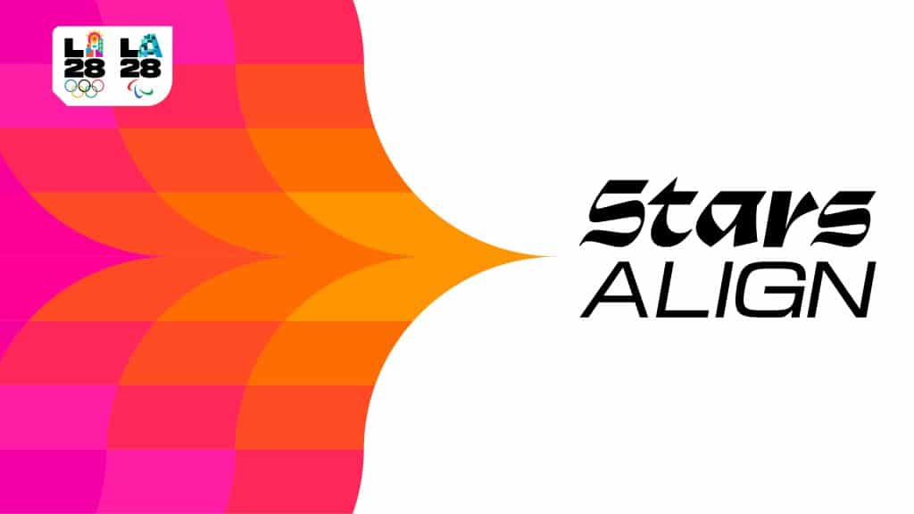
Behind it all sits the Look of the Games, launched earlier this year with far less noise than it deserved. It takes its cue from Southern California’s superblooms, those rare springs when the desert bursts into wildflowers, and from the Bird of Paradise, the city’s official flower. The result is an endless loop of petals and bands in pink, orange and gold, designed to stretch from stadium facades down to accreditation badges. Loud, warm, unashamedly cheerful: a clear descendant of the magenta, vermilion and aqua that Deborah Sussman spread across Los Angeles in 1984.
The slogan itself launched with a 60 second film set to Can’t Stop by Red Hot Chili Peppers, which is about as LA as a soundtrack gets.
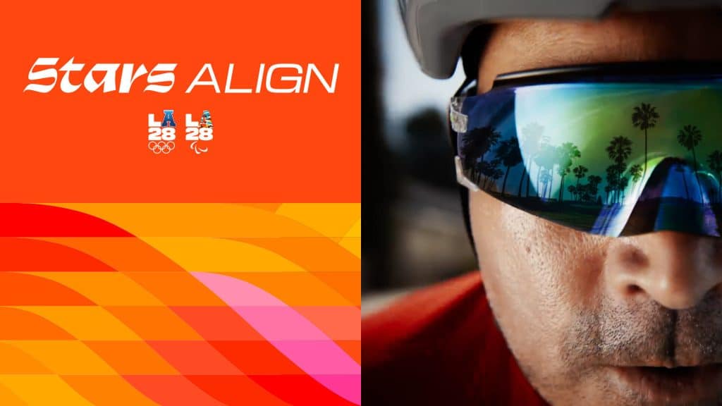
Will Stars Align end up on a T-shirt people actually want to wear? Too early to say. But at a time when global sports brands tend to sand everything down to the same polite geometry, a slogan that looks like it was painted over a strip mall feels like the right kind of risk. We will be keeping count of the A’s.