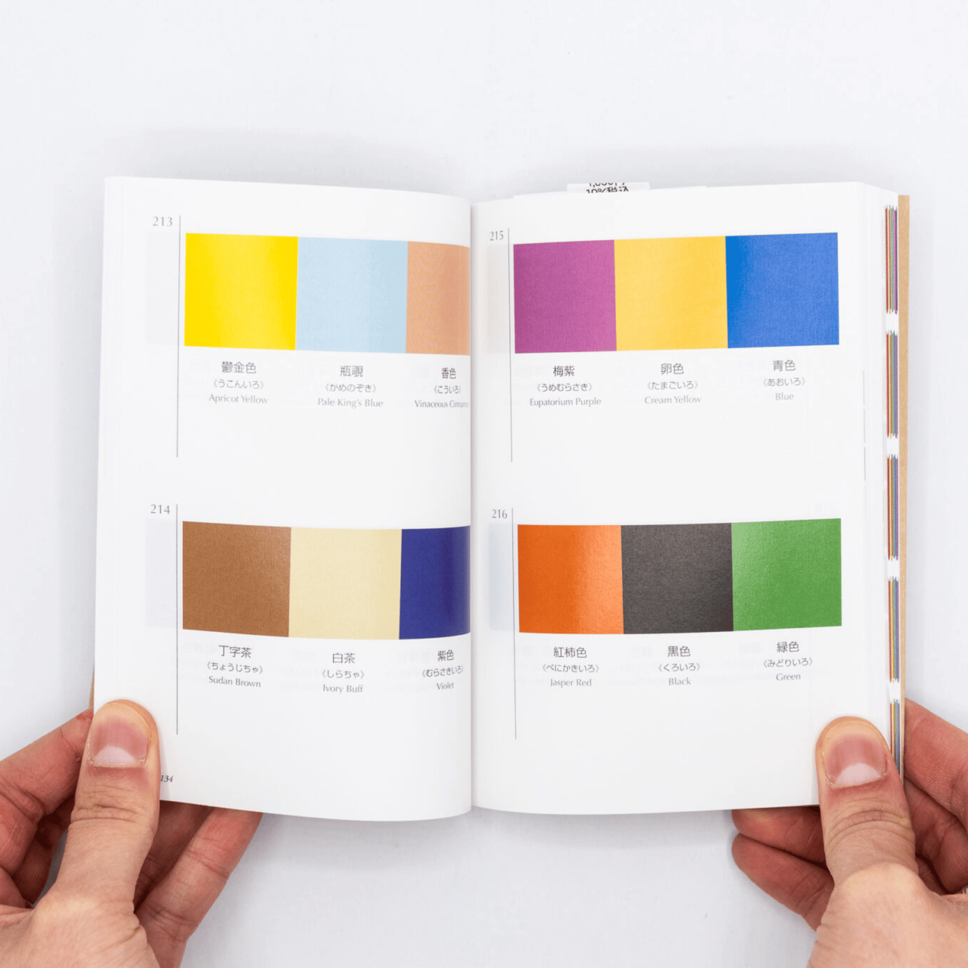
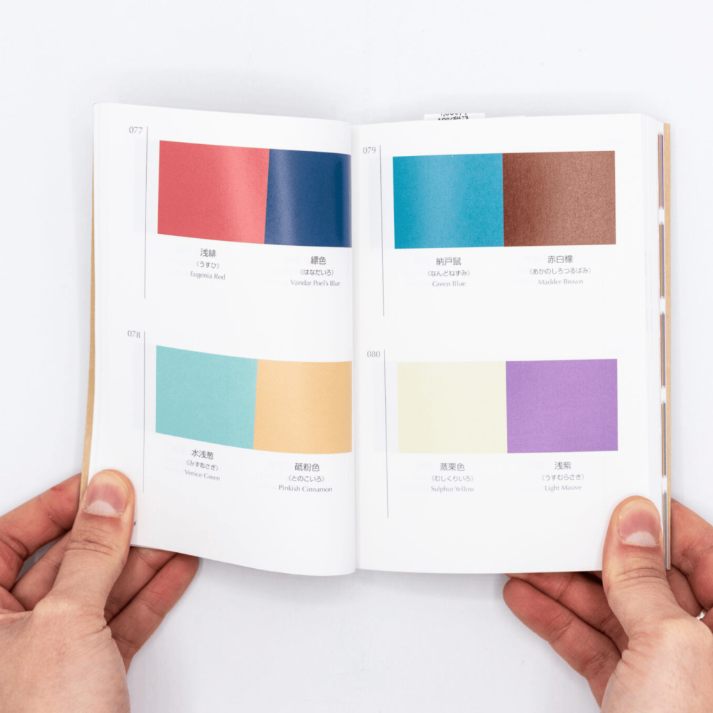
A dusty pink pressed against slate. Raw sienna leaning on a midnight blue. Ivory buff above a slab of burnt orange. Each page of A Dictionary of Color Combinations holds a few rectangles of flat colour, a number, and very little else. The book is small enough to hold open in one hand, yet it has become one of the most shared objects in design feeds: on Instagram, reel after reel shows people flipping through its pages and showing what they built from them, from outfits to painted rooms and even make-up looks, while Reddit’s r/Design keeps bringing it back.
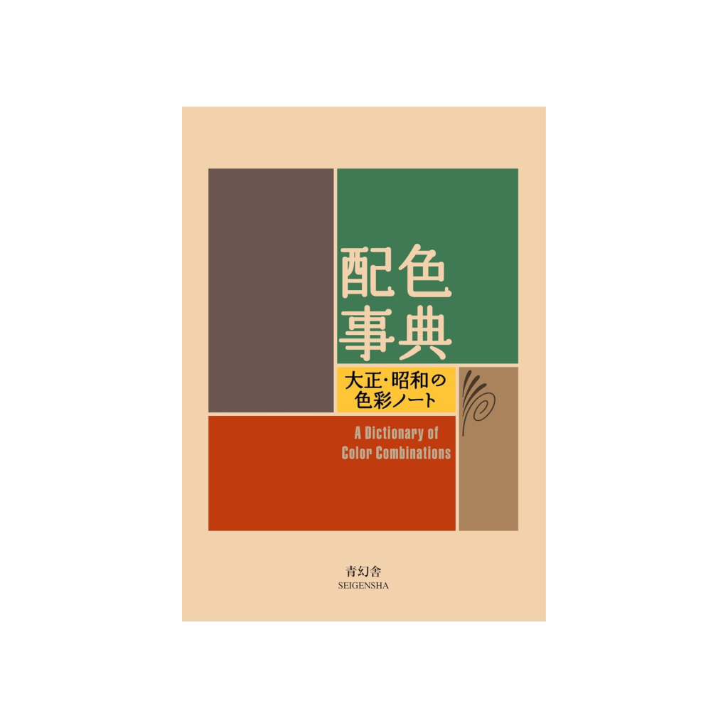
Behind the rectangles is Sanzo Wada (1883 to 1967), artist, teacher, costume and kimono designer during a turbulent time in avant-garde Japanese art and cinema. Between 1933 and 1934 he published Haishoku Soukan, six volumes of colour studies documenting over a thousand combinations. Kyoto publisher Seigensha later distilled them into 348 two, three and four colour combinations in an A6 pocket book.
Wada treated colour pairing as a discipline when few did, setting Japanese tradition beside what he absorbed from the West. He founded the Japan Standard Color Association in 1927, turned it into the Japan Color Research Institute in 1945 and in 1951 completed Japan’s first comprehensive standard colour chart. In 1955 he won the Academy Award for Best Costume Design (Color) for Teinosuke Kinugasa’s Gate of Hell. The man knew what colour does on a body, on a screen and on a page.
Pairs, trios, quartets
The book builds up slowly: two colours, then three, then four. Watch one hue travel through it and it changes temperament with every neighbour, warm here, sour there, almost absent somewhere else. At the back the dictionary turns into a toolkit, with named swatches and CMYK values laid out like a Pantone fan, ready to be cut, matched and recombined. The text is mostly Japanese, the colour names come in Japanese and English, and none of it really matters. As The Japan Times put it, the colours speak for themselves.
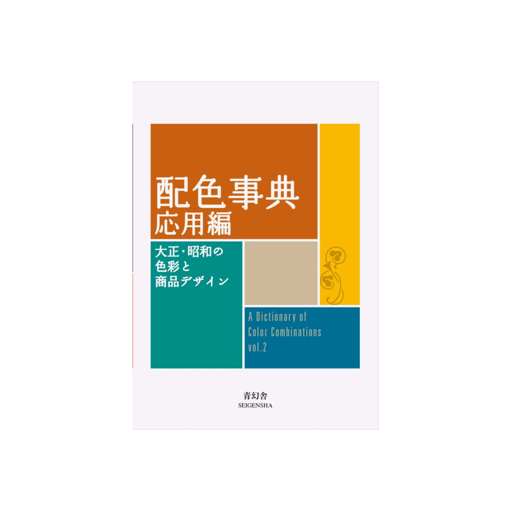
A second volume, published in 2020, gathers two more works from 1935 to 1936 and from 1938, adding 237 combinations: 72 built around the Japanese seasons, 165 drawn from fashion, interiors and graphic design.
From paper to screen
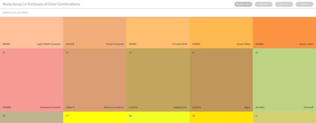
On screen, the dictionary lives at sanzo-wada.dmbk.io, Dain M. Blodorn Kim’s interactive version, released as open source, where every palette can be browsed and every value copied. It has even become an R package, bringing 60 of Wada’s palettes into data visualisation. Digital values come from converting CMYK, and every version converts a little differently, so the screen always runs hotter than the paper. The printed pages are softer, chalkier, better.
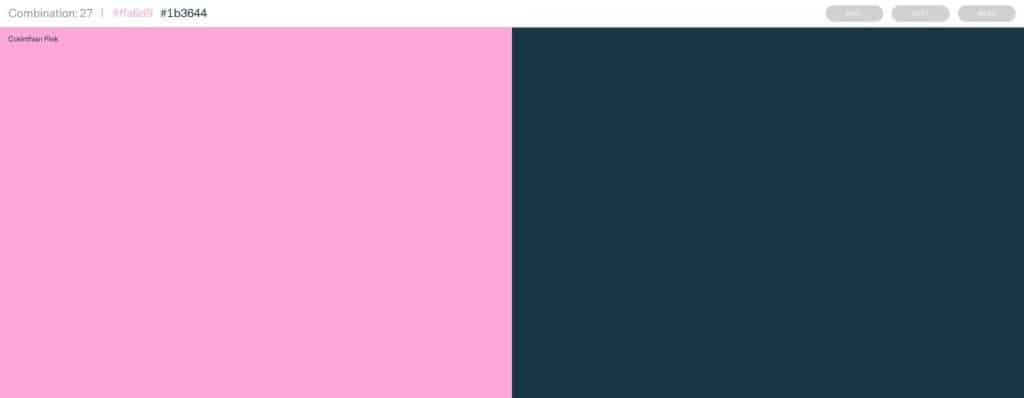
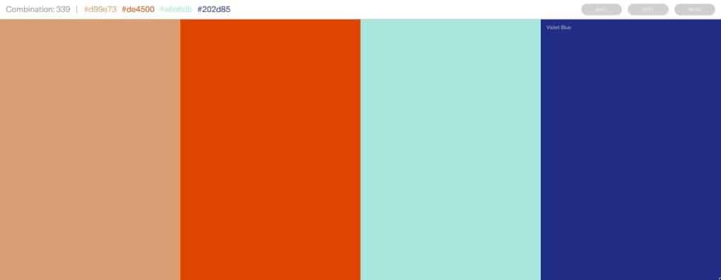
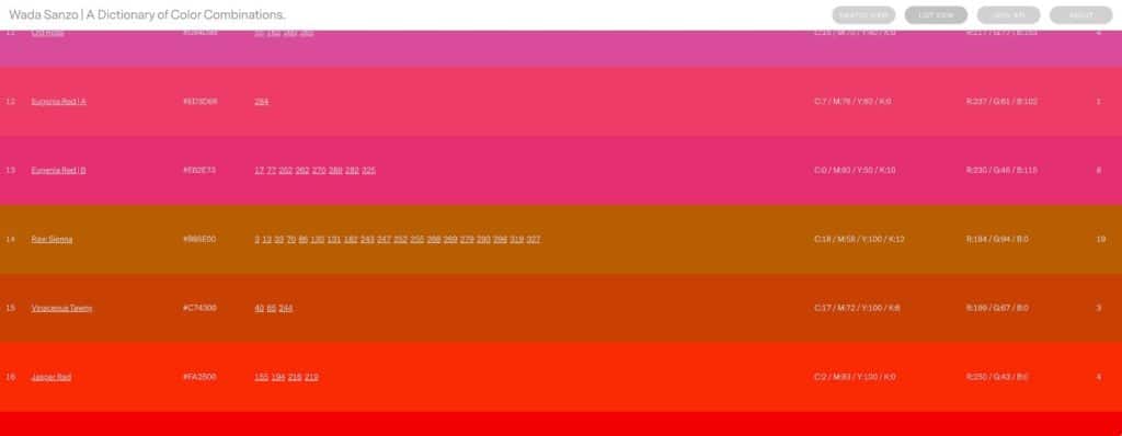
Palette generators promise harmony in one click. Wada offers something they can’t: choices, made by an eye, ninety years ago. Many of them look as if they were picked this morning.
Book: A Dictionary of Color Combinations, Vol. 1 and Vol. 2
Author: Sanzo Wada
Publisher: Seigensha, Kyoto
Format: A6 pocket book, Japanese and English
Digital version: sanzo-wada.dmbk.io
Available at: Bonvini 1909, Saypaper
Images: Saypaper, screenshots of sanzo-wada.dmbk.io
Via: The Japan Times, Reddit r/Design