This month Design Week Mexico · Designblok · Venice Design Week · Barcelona Design Week · Dutch Design Week · Designart Tokyo Calendar
,

Color of the year | Pantone

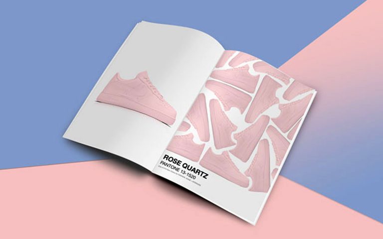
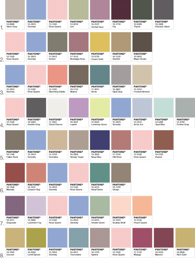
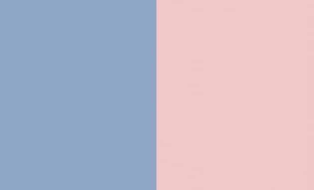
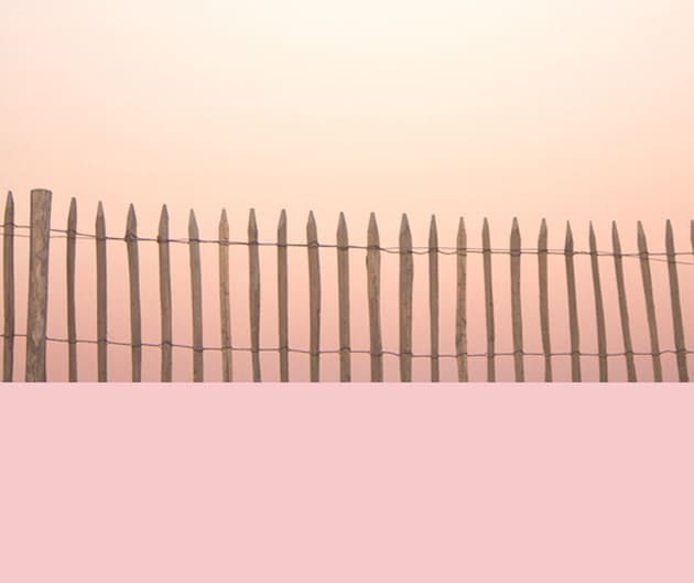
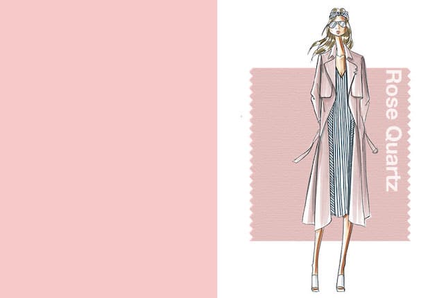
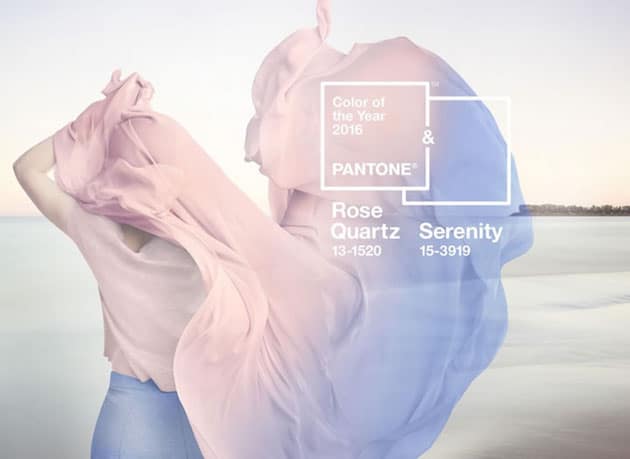
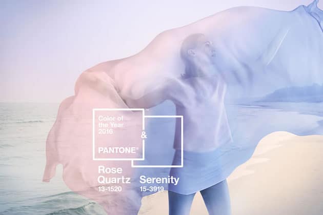
The color of the year for 2016 as Pantone proclaimed is the blending of two shades: rose quartz and serenity. As consumers seek mindfulness and well-being as an antidote to modern day stresses, welcoming colors that psychologically fulfill our yearning for reassurance and security are becoming more prominent. Joined together, Rose Quartz and Serenity demonstrate an inherent balance between a warmer embracing rose tone and the cooler blue, reflecting connection and wellness as well as a soothing sense of order and peace. So, whether in soft or hard surface material, the pairing of Rose Quartz and Serenity brings calm and relaxation. As you can see from the tables below appealing in all finishes, matte, metallic and glossy, the engaging combo joins easily with other mid-tones including greens and purples, rich browns, and all shades of yellow and pink. Add in silver or hot brights for more splash and sparkle.
Images Credit Pantone
rose-quartzPantone_FeelDesain_06
rose-quartzPantone_FeelDesain_02rose-quartzPantone_FeelDesain_05 rose-quartzPantone_FeelDesain_03rose-quartzPantone_FeelDesain_01 rose-quartzPantone_FeelDesain_09 rose-quartzPantone_FeelDesain_08rose-quartzPantone_FeelDesain_07


Via Pantone

Plan your design year

30 festivals and 30 awards worth knowing

SubmissionGot a project we should see?

Architecture, design, art, photography: send it to our editors in a few minutes.

Send your project
AboutAn independent magazine since 2010

More than 7,000 stories on design, architecture and art, made in Turin.

About Feel Desain